一共收集整理了图形20个,比较实用,同时也为了熟悉CSS的代码。整合了一下,有错误欢迎指出。
1.正方形
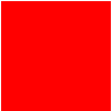
#square {
	width: 100px;
	height: 100px;
	background: red;
}
2.长方形

#rectangle {
	width: 200px;
	height: 100px;
	background: red;
}
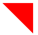
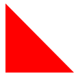
3.左上三角

#triangle-topleft {
	width: 0;
	height: 0;
	border-top: 100px solid red;
	border-right: 100px solid transparent;
}
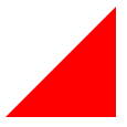
4.右上三角
#triangle-topright {
	width: 0;
	height: 0;
	border-top: 100px solid red;
	border-left: 100px solid transparent;
}
5.左下三角
#triangle-bottomleft {
	width: 0;
	height: 0;
	border-bottom: 100px solid red;
	border-right: 100px solid transparent;
}
6.右下三角
#triangle-bottomright {
	width: 0;
	height: 0;
	border-bottom: 100px solid red;
	border-left: 100px solid transparent;
}
7.平行四边形
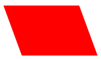
#parallelogram {
	width: 150px;
	height: 100px;
	-webkit-transform: skew(20deg);
	  -moz-transform: skew(20deg);
	    -o-transform: skew(20deg);
	background: red;
}
8.梯形
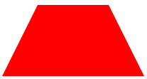
#trapezoid {
	border-bottom: 100px solid red;
	border-left: 50px solid transparent;
	border-right: 50px solid transparent;
	height: 0;
	width: 100px;
}
9.六角星

#star-six {
	width: 0;
	height: 0;
	border-left: 50px solid transparent;
	border-right: 50px solid transparent;
	border-bottom: 100px solid red;
	position: relative;
}
#star-six:after {
	width: 0;
	height: 0;
	border-left: 50px solid transparent;
	border-right: 50px solid transparent;
	border-top: 100px solid red;
	position: absolute;
	content: "";
	top: 30px;
	left: -50px;
}
10.五角星

#star-five {
   margin: 50px 0;
   position: relative;
   display: block;
   color: red;
   width: 0px;
   height: 0px;
   border-right:  100px solid transparent;
   border-bottom: 70px  solid red;
   border-left:   100px solid transparent;
   -moz-transform:    rotate(35deg);
   -webkit-transform: rotate(35deg);
   -ms-transform:     rotate(35deg);
   -o-transform:      rotate(35deg);
}
#star-five:before {
   border-bottom: 80px solid red;
   border-left: 30px solid transparent;
   border-right: 30px solid transparent;
   position: absolute;
   height: 0;
   width: 0;
   top: -45px;
   left: -65px;
   display: block;
   content: '';
   -webkit-transform: rotate(-35deg);
   -moz-transform:    rotate(-35deg);
   -ms-transform:     rotate(-35deg);
   -o-transform:      rotate(-35deg);

}
#star-five:after {
   position: absolute;
   display: block;
   color: red;
   top: 3px;
   left: -105px;
   width: 0px;
   height: 0px;
   border-right: 100px solid transparent;
   border-bottom: 70px solid red;
   border-left: 100px solid transparent;
   -webkit-transform: rotate(-70deg);
   -moz-transform:    rotate(-70deg);
   -ms-transform:     rotate(-70deg);
   -o-transform:      rotate(-70deg);
   content: '';
}
11.五边形
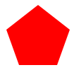
#pentagon {
    position: relative;
    width: 54px;
    border-width: 50px 18px 0;
    border-style: solid;
    border-color: red transparent;
}
#pentagon:before {
    content: "";
    position: absolute;
    height: 0;
    width: 0;
    top: -85px;
    left: -18px;
    border-width: 0 45px 35px;
    border-style: solid;
    border-color: transparent transparent red;
}
12.六边形
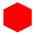
#hexagon {
	width: 100px;
	height: 55px;
	background: red;
	position: relative;
}
#hexagon:before {
	content: "";
	position: absolute;
	top: -25px;
	left: 0;
	width: 0;
	height: 0;
	border-left: 50px solid transparent;
	border-right: 50px solid transparent;
	border-bottom: 25px solid red;
}
#hexagon:after {
	content: "";
	position: absolute;
	bottom: -25px;
	left: 0;
	width: 0;
	height: 0;
	border-left: 50px solid transparent;
	border-right: 50px solid transparent;
	border-top: 25px solid red;
}
13.桃心
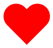
#heart {
    position: relative;
    width: 100px;
    height: 90px;
}
#heart:before,
#heart:after {
    position: absolute;
    content: "";
    left: 50px;
    top: 0;
    width: 50px;
    height: 80px;
    background: red;
    -moz-border-radius: 50px 50px 0 0;
    border-radius: 50px 50px 0 0;
    -webkit-transform: rotate(-45deg);
       -moz-transform: rotate(-45deg);
        -ms-transform: rotate(-45deg);
         -o-transform: rotate(-45deg);
            transform: rotate(-45deg);
    -webkit-transform-origin: 0 100%;
       -moz-transform-origin: 0 100%;
        -ms-transform-origin: 0 100%;
         -o-transform-origin: 0 100%;
            transform-origin: 0 100%;
}
#heart:after {
    left: 0;
    -webkit-transform: rotate(45deg);
       -moz-transform: rotate(45deg);
        -ms-transform: rotate(45deg);
         -o-transform: rotate(45deg);
            transform: rotate(45deg);
    -webkit-transform-origin: 100% 100%;
       -moz-transform-origin: 100% 100%;
        -ms-transform-origin: 100% 100%;
         -o-transform-origin: 100% 100%;
            transform-origin :100% 100%;
}
14.无限大符号
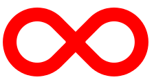
#infinity {
    position: relative;
    width: 212px;
    height: 100px;
}


#infinity:before,
#infinity:after {
    content: "";
    position: absolute;
    top: 0;
    left: 0;
    width: 60px;
    height: 60px;
    border: 20px solid red;
    -moz-border-radius: 50px 50px 0 50px;
         border-radius: 50px 50px 0 50px;
    -webkit-transform: rotate(-45deg);
       -moz-transform: rotate(-45deg);
        -ms-transform: rotate(-45deg);
         -o-transform: rotate(-45deg);
            transform: rotate(-45deg);
}


#infinity:after {
    left: auto;
    right: 0;
    -moz-border-radius: 50px 50px 50px 0;
         border-radius: 50px 50px 50px 0;
    -webkit-transform: rotate(45deg);
       -moz-transform: rotate(45deg);
        -ms-transform: rotate(45deg);
         -o-transform: rotate(45deg);
            transform: rotate(45deg);
}
15.蛋
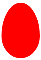
#egg {
   display:block;
   width: 126px;
   height: 180px;
   background-color: red;
   -webkit-border-radius: 63px 63px 63px 63px / 108px 108px 72px 72px;
   border-radius:        50%   50%  50%  50%  / 60%   60%   40%  40%;
}
16.提示对话框

#talkbubble {
   width: 120px;
   height: 80px;
   background: red;
   position: relative;
   -moz-border-radius:    10px;
   -webkit-border-radius: 10px;
   border-radius:         10px;
}
#talkbubble:before {
   content:"";
   position: absolute;
   right: 100%;
   top: 26px;
   width: 0;
   height: 0;
   border-top: 13px solid transparent;
   border-right: 26px solid red;
   border-bottom: 13px solid transparent;
}
17.十二角星

#burst-8 {
    background: red;
    width: 80px;
    height: 80px;
    position: relative;
    text-align: center;
    -webkit-transform: rotate(20deg);
       -moz-transform: rotate(20deg);
        -ms-transform: rotate(20deg);
         -o-transform: rotate(20eg);
            transform: rotate(20deg);
}
#burst-8:before {
    content: "";
    position: absolute;
    top: 0;
    left: 0;
    height: 80px;
    width: 80px;
    background: red;
    -webkit-transform: rotate(135deg);
       -moz-transform: rotate(135deg);
        -ms-transform: rotate(135deg);
         -o-transform: rotate(135deg);
            transform: rotate(135deg);
}
18.八角星

#burst-8 {
    background: red;
    width: 80px;
    height: 80px;
    position: relative;
    text-align: center;
    -webkit-transform: rotate(20deg);
       -moz-transform: rotate(20deg);
        -ms-transform: rotate(20deg);
         -o-transform: rotate(20eg);
            transform: rotate(20deg);
}
#burst-8:before {
    content: "";
    position: absolute;
    top: 0;
    left: 0;
    height: 80px;
    width: 80px;
    background: red;
    -webkit-transform: rotate(135deg);
       -moz-transform: rotate(135deg);
        -ms-transform: rotate(135deg);
         -o-transform: rotate(135deg);
            transform: rotate(135deg);
}
19.钻石
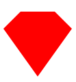
#cut-diamond {
    border-style: solid;
    border-color: transparent transparent red transparent;
    border-width: 0 25px 25px 25px;
    height: 0;
    width: 50px;
    position: relative;
    margin: 20px 0 50px 0;
}
#cut-diamond:after {
    content: "";
    position: absolute;
    top: 25px;
    left: -25px;
    width: 0;
    height: 0;
    border-style: solid;
    border-color: red transparent transparent transparent;
    border-width: 70px 50px 0 50px;
}
20.八卦
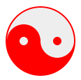
#yin-yang {
	width: 96px;
	height: 48px;
	background: #eee;
	border-color: red;
	border-style: solid;
	border-width: 2px 2px 50px 2px;
	border-radius: 100%;
	position: relative;
}
#yin-yang:before {
	content: "";
	position: absolute;
	top: 50%;
	left: 0;
	background: #eee;
	border: 18px solid red;
	border-radius: 100%;
	width: 12px;
	height: 12px;
}
#yin-yang:after {
	content: "";
	position: absolute;
	top: 50%;
	left: 50%;
	background: red;
	border: 18px solid #eee;
	border-radius:100%;
	width: 12px;
	height: 12px;
}
注
原文:http://www.wzsky.net/html/Website/CSS/115159.html
原文网址:http://yanhaijing.com/css/2014/04/04/with-css-code-to-write-various-shapes-graphic-method/